Demo Page: PhotoSwipe Gallery
How to
Things used in this demo:
- PhotoSwipe for generating gallery overlays;
- Custom CSS sheets defining classes for single image, fixed-width slide and fixed-height slide;
Code structure:
- PhotoSwipe CSS and JavaScript;
- Class
imgDisplayto signify a photo gallery; - Classes
monod,monowandmonohfor single image, fixed-width slide and fixed-height slide styles; - A separate
htmldocument addingpswproot elements to the page; - Vanilla
initPhotoSwipeFromDOM.js.
Adding items after init
initPhotoSwipeFromDOM.js is just an example of how to build a slide from a set of image links. Maybe we can try to modify it so that it is possible to call var collage = new PhotoSwipe( p, P, i, o ) from on-page scripts while maintaining current link-reading capability and customizations.
What I’m trying to achieve: show a single image, which is a collage of multiple images itself, on the page. When clicked it would start showing actual images in that collage as slides. Current thoughts:
- use
imgDisplay+monodto show the collage image, as usual; - In on-page script call
var collage = new PhotoSwipe( p, P, i, o )and then add slides via API:pswp.items.push({ ... }); - To do that, while maintaining current customizations,
initPhotoSwipeFromDOM.jsneeds to be dissected and restructured so that the function callnew PhotoSwipe( ... )is exposed. - I’ve tested the possibility to push an item and can confirm that it works as documented. However if a slide does not have a corresponding thumbnail on the page, the gallery would freeze upon hitting close. It is most likely because
initPhotoSwipeFromDOM.jsis not meant to handle such use case.
I am hopeful this can be done, without too much effort.
Update 09/13
After fruitless searches and experimentations I failed to produce a working script that does what I have described above. However while reading through the SEO section of PhotoSwipe documentation, it occurred to me that I’ve been looking at this totally wrong.
It is so straight forward and simple that I may as well have been a complete moron to not see this. To create a gallery that shows fewer thumbnails than there are images, simply hiding the rest of the thumbnails with display: none would do. But I need to test it first. Like Dr. Whitehall used to say, discovery requires experimentation.
There! Easy-peasy-lemon-squeezy! Do notice that if I use visibility: hidden the slide would return to its hidden position upon closing. Not very elegant, is it? display: none would have the slide escaping to the top left corner of the screen. Equally confusing. What I did is position: absolute; visibility: hidden;, this way the slides would return to the first thumbnail. Still, the escaping slide would just disappear behing the first thumbnail, but it is the easiest solution right now. I can’t rewrite the animation effect, I don’t have the skill yet.
Yet an improved solution would be to set the thumbnail to a very small size, say max-width: 10px;, so the slide would disappear into the first thumbnail. Now need to find a way to position those tiny thumbnails so that they would line up with their respective positions in the collage image.
Now next step is to replace that first thumbnail with a collage, like a poster or cover for the collection. I remember needing to make some adjustment if there is aspect ratio mismatch between the thumbnail and the actual image.
Single Image, Centered

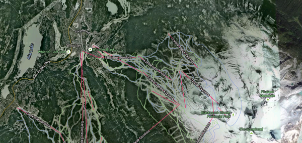
Imagery ©2015 DigitalGlobe, Province of British Columbia, Map data ©2015 Google
Slide with Fixed-width Thumbnails
Slide with Fixed-height Thumbnails
Caveats
Due to the flowing nature of the container, neither of the thumbnail groups look overly nice on a narrow screen. But the fixed-height slide does not have those weird blanks when fitted into a small screen. The actual gallery overlay looks fine on all screens, pleasantly. The width and heights can also be overridden with internal CSS.
Code
<!-- Single image -->
    <div class="imgDisplay monod" style="max-width: 600px;" itemscope itemtype="http://schema.org/ImageGallery">
      <figure itemprop="associatedMedia" itemscope itemtype="http://schema.org/ImageObject">
        <a href="/assets/images/maps-whistler-1024x486.png" itemprop="contentUrl" data-size="1024x486" >
        <img src="/assets/images/maps-whistler-600x285.png" itemprop="thumbnail" alt="Satellite view of Whistler." />
        </a>
        <figcaption itemprop="caption description">Satellite view of Whistler.<br/><p class="tiny">Imagery ©2015 DigitalGlobe, Province of British Columbia, Map data ©2015 Google</p></figcaption>
      </figure>
    </div>
    <!-- Fixed-width slide -->
    <div class="imgDisplay monow" itemscope itemtype="http://schema.org/ImageGallery">
      <figure itemprop="associatedMedia" itemscope itemtype="http://schema.org/ImageObject">
        <a href="/assets/old/DSC02385.jpg" itemprop="contentUrl" data-size="447x597">
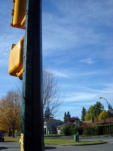
        <img src="/assets/old/DSC02385-m.jpg" itemprop="thumbnail" alt="我在想如果照的是信号灯的正面会不会好点。" />
        </a>
        <figcaption itemprop="caption description">我在想如果照的是信号灯的正面会不会好点。</figcaption>
      </figure>
      <!-- add more images here -->
    </div>
    <!-- Fixed-height slide -->
    <div class="imgDisplay monoh" itemscope itemtype="http://schema.org/ImageGallery">
      <figure itemprop="associatedMedia" itemscope itemtype="http://schema.org/ImageObject">
        <a href="/assets/old/DSC02385.jpg" itemprop="contentUrl" data-size="447x597">
        <img src="/assets/old/DSC02385-m.jpg" itemprop="thumbnail" alt="我在想如果照的是信号灯的正面会不会好点。" />
        </a>
        <figcaption itemprop="caption description">我在想如果照的是信号灯的正面会不会好点。</figcaption>
      </figure>
      <!-- add more images here -->
    </div>

    <style>
    /* photoswipe image gallery
     * common container class
     * for easy js invoking*/
     .imgDisplay {}
     .imgDisplay figure {}
     .imgDisplay img {}
     .imgDisplay figcaption {}

    /* Classes for single image display,
     * fixed-width slide and
     * fixed-height slide galleries
     */
    .monoh, .monow {
      width: 100%;
      float: left;
      clear: both;
      margin-bottom: 0.7rem;
    }
    .monod {
      position: relative;
      margin: 0 auto;
    }
    .monoh figure {
      display: block;
      float: left;
      margin: 0 5px 5px 0;
      height: 120px;
      width: auto;
    }
    .monow figure {
      display: block;
      float: left;
      margin: 0 5px 5px 0;
      width: 150px;
      height: auto;
    }
    .monod figure {
      display: block;
      margin: 0 auto;
      width: 100%;
      height: auto;
    }
    .monoh img {
      width: auto;
      height: 100%;
    }
    .monow img, .monod img {
      width: 100%;
      height: auto;
    }
    .monoh figcaption, .monow figcaption, .monod figcaption {
      display: none;
    }
    </style>


